

Components
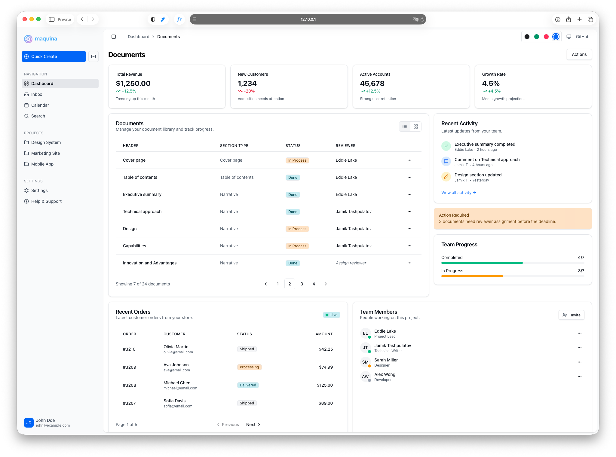
UI components for Rails. ERB partials styled with Tailwind CSS 4.0 and Stimulus controllers. Inspired by shadcn/ui, built for Rails.
Production-ready UI components for Rails applications. Copy-paste ERB partials styled with Tailwind CSS 4.0 and optional Stimulus controllers.
What you get:
- 20+ components — From layouts to forms, navigation to feedback
- Zero dependencies — Just Tailwind CSS and optionally Stimulus
- Token-driven theming — Familiar shadcn/ui CSS variables for color, plus tokens for shape, elevation, focus rings and weight
- Rails conventions — ERB partials, data attributes, form helpers

Already on 0.5.1? 0.6.0 is a deliberately breaking release: engine CSS moved into
@layer components, and radius, elevation, focus rings and weights became tokens. One change affects every existing app and fails silently — the unlayered*rule in your installedtheme.css. Run the scanner, then read the guide:bundle update maquina-components bin/rails maquina:doctor
Latest release: 0.7.1. No API changes, but not purely additive: a
requiredfield with noplaceholderused to paint the error state from first paint, and the fix means an app that renders server-side errors without settingaria-invalidloses its error border. Field error text gains its own--destructive-texttoken — one line of theme CSS if your palette is the saturated kind. The dropdown menu and menu button now flip when they hit the bottom of the viewport, and all eighteen leaf partials accept a block.maquina:doctorgained five rules for this release.
Demo Application
Explore all components in action without installing anything. The demo showcases light/dark themes, color themes, and responsive layouts.
For local development, clone the components repository:
git clone https://github.com/maquina-app/maquina_components.git
cd maquina_components/test/dummy
bin/rails server
Visit http://localhost:3000 to explore the components locally.
Quick Start
1. Add the Gem
# Gemfile
gem "maquina-components"
bundle install
2. Run the Install Generator
bin/rails generate maquina_components:install
This adds the engine CSS import, theme variables (shadcn/ui convention), a shape/state token block for radius, elevation, focus rings and weights, and a helper file for icon customization.
Re-running the generator is safe: it is idempotent, appends each block only once, and never rewrites your palette.
3. Start Using Components
<%= render "components/card" do %>
  <%= render "components/card/header" do %>
    <%= render "components/card/title", text: "Welcome" %>
  <% end %>
  <%= render "components/card/content" do %>
    <p>Your content here</p>
  <% end %>
<% end %>
Every partial takes its content three ways, and they are interchangeable — containers and leaves alike:
<%= render "components/card/title", text: "Welcome" %>
<%= render "components/card/title", content: "Welcome" %>
<%= render "components/card/title" do %>Welcome<% end %>
text: wins when present, then content:, then the block. Pass a block whenever the content is markup rather than a string. Before 0.7.1 half the leaf partials silently dropped the block, so if you worked around that with capture, you no longer need to.
For form elements, use data attributes:
<%= form_with model: @user do |f| %>
  <%= f.text_field :email, data: { component: "input" } %>
  <%= f.submit "Save", data: { component: "button", variant: "primary" } %>
<% end %>
AI-Assisted Development
Use the Maquina UI Standards Claude Code plugin to generate views that follow component conventions automatically.
Instead of correcting AI-generated code (“use the card partial, not a div”), the plugin teaches Claude your component patterns:
> Create the users index view with a table showing name, email, and status
Claude generates code using your actual components — proper partials, correct data attributes, and consistent patterns.
Available Components
Layout
| Component | Description |
|---|---|
| Sidebar | Collapsible navigation with mobile support and keyboard shortcuts |
| Header | Page header for sidebar layouts with breadcrumbs and actions |
| Drawer | Slide-out panel with overlay, persistence, and keyboard shortcut |
Content
| Component | Description |
|---|---|
| Card | Content containers with header, body, and footer sections |
| Alert | Callouts with 4 variants and icon support |
| Badge | Status indicators with 7 variants and 3 sizes |
| Table | Responsive data tables with striped and bordered variants, sticky headers, and a collection helper |
| Empty State | Placeholder for no-data scenarios with icons and actions |
| Separator | Horizontal or vertical divider |
| Stats | Metric cards in a responsive grid |
Navigation
| Component | Description |
|---|---|
| Breadcrumbs | Navigation with responsive collapsing support |
| Dropdown Menu | Actions menu triggered by a button with keyboard navigation |
| Pagination | Navigation for paginated content with Pagy integration |
Interactive
| Component | Description |
|---|---|
| Calendar | Date selection with single and range modes |
| Combobox | Searchable dropdown with keyboard navigation and filtering |
| Date Picker | Popover calendar triggered by a button for date selection |
| Toggle Group | Single or multiple selection button groups |
Feedback
| Component | Description |
|---|---|
| Toast | Non-intrusive notifications with auto-dismiss and variants |
Forms
| Component | Description |
|---|---|
| Form Components | Inputs, selects, checkboxes styled with data attributes |
Prerequisites
The generator requires tailwindcss-rails:
bundle add tailwindcss-rails
bin/rails tailwindcss:install
Stimulus Setup
Interactive components (Sidebar, Dropdown Menu, Toggle Group, Breadcrumbs, Combobox, Toast) require Stimulus. With importmaps:
# config/importmap.rb
pin "@hotwired/turbo-rails", to: "turbo.min.js"
pin "@hotwired/stimulus", to: "stimulus.min.js"
pin "@hotwired/stimulus-loading", to: "stimulus-loading.js"
pin_all_from "app/javascript/controllers", under: "controllers"
// app/javascript/application.js
import "@hotwired/turbo-rails"
import { Application } from "@hotwired/stimulus"
import { eagerLoadControllersFrom } from "@hotwired/stimulus-loading"

const application = Application.start()
application.debug = false
window.Stimulus = application

eagerLoadControllersFrom("controllers", application)
Static components (Badge, Card, Alert, Button, form elements) work without JavaScript.
Extending Component Behavior
Every component merges your data: hash with its own data attributes. Identity keys (component, variant, size) always win, but controller and action concatenate — so you can attach your own Stimulus behavior to any component without losing the built-in one:
<%= render "components/combobox", name: "country",
      data: { controller: "analytics", action: "change->analytics#track" } %>
<%# renders data-controller="combobox analytics" %>
Icons
Components render icons through the icon_for helper, which falls back to a built-in set of inline SVGs (check, chevrons, calendar, search, mail, trash, and more):
<%= icon_for :check, class: "size-4" %>
<%= icon_for :trash, class: "size-4", stroke_width: 1.5 %>
To use your own icon system (Heroicons, Lucide, inline SVG files), override main_icon_svg_for in the generated MaquinaComponentsHelper — icon_for consults it first and only falls back to the built-ins when it returns nil:
# app/helpers/maquina_components_helper.rb
def main_icon_svg_for(name)
  lucide_icon(name)
end
Or return the SVG yourself, a name at a time:
module MaquinaComponentsHelper
  def main_icon_svg_for(name)
    case name
    when :home
      <<~SVG
        <svg xmlns="http://www.w3.org/2000/svg" width="24" height="24" viewBox="0 0 24 24" fill="none" stroke="currentColor" stroke-width="2" stroke-linecap="round" stroke-linejoin="round">
          <path d="M15 21v-8a1 1 0 0 0-1-1h-4a1 1 0 0 0-1 1v8"/>
          <path d="M3 10a2 2 0 0 1 .709-1.528l7-5.999a2 2 0 0 1 2.582 0l7 5.999A2 2 0 0 1 21 10v9a2 2 0 0 1-2 2H5a2 2 0 0 1-2-2z"/>
        </svg>
      SVG
    end
  end
end
Icons are sourced from Lucide. Copy SVG code directly from their website.
What the override does and does not reach
main_icon_svg_for backs the public icon_for helper — every icon you render, plus the component parameters that take an icon name (alert, sidebar menu items, empty states, breadcrumb separators).
It deliberately does not reach the icons an engine component renders for itself: a dropdown trigger’s chevron, the toast close button, the calendar’s arrows. Those go through an internal builtin_icon_for that only ever reads the engine’s own set, so a component looks the same in every app regardless of how you have configured icons — and so a partial override cannot leave a control without its affordance.
The practical consequence: if an engine component’s own icon looks wrong or missing, defining that name in main_icon_svg_for will not change it. That is a bug in the engine, not something to fix in your app — please report it.
Catching typos: strict_icons
An unknown icon name renders nothing at all, which is invisible in review and in production. MaquinaComponents.strict_icons raises UnknownIconError instead. It is on by default in development and test and off in production, so a typo fails loudly while you work and can never take a page down for a user.
# config/initializers/maquina_components.rb
MaquinaComponents.strict_icons = false   # opt out; unknown names render nothing
This covers both helpers. If it raises for a name you never wrote yourself, an engine component asked for an icon the engine does not ship — the message says so, and says that a main_icon_svg_for entry will not help.
Theme Variables
Colors are CSS variables following the shadcn/ui theming convention.
Each one is defined twice, which Tailwind CSS v4 requires: in :root for the value, and in @theme so it also becomes a utility (bg-primary, text-muted-foreground).
:root {
  --primary: oklch(0.488 0.243 264.376);
  --primary-foreground: oklch(0.985 0 0);
}

@theme {
  --color-primary: var(--primary);
  --color-primary-foreground: var(--primary-foreground);
}
Edit the values in :root to match your brand — the generator installs neutral grays. Adding a semantic color works the same way: declare it in :root, then mirror it in @theme if you want the utility.
Everything that is not a color — shape, focus rings, elevation, weights, control marks — is a token too, and a theme changes values, not selectors. See Theming for the full token table, ready-made themes, and how to pin a single component.
Generator Options
# Skip theme variables (if you already have them)
bin/rails generate maquina_components:install --skip-theme

# Skip helper creation
bin/rails generate maquina_components:install --skip-helper

# Skip both
bin/rails generate maquina_components:install --skip-theme --skip-helper
File Structure After Setup
app/
├── assets/tailwind/
│   └── application.css               # Theme + engine import
├── helpers/
│   └── maquina_components_helper.rb  # Icon override
├── javascript/
│   └── application.js                # Stimulus init
└── views/layouts/
    └── application.html.erb          # Layout with components
Troubleshooting
Generator Issues
“tailwindcss-rails doesn’t appear to be installed”
Install it first:
bundle add tailwindcss-rails
bin/rails tailwindcss:install
Runtime Issues
Sidebar trigger not working
- Ensure Stimulus is initialized
- Verify provider wraps both sidebar and content
- Check browser console for errors
Styles not applying
- Verify engine CSS is imported after
@import "tailwindcss"; - Check that
@themeblock exists with color bindings - Restart dev server after CSS changes
Dark mode not working
- Add
.darkclass to<html>element - Ensure
.dark { }block has variable overrides
Icons not rendering
- Check the icon name matches your
main_icon_svg_forcases - Verify the helper is included in
ApplicationHelper - Turn on
strict_iconsin development so an unknown name raises instead of rendering nothing - If the missing icon belongs to a component rather than to your own markup (a trigger’s chevron, a close button),
main_icon_svg_forcannot fix it — see Icons